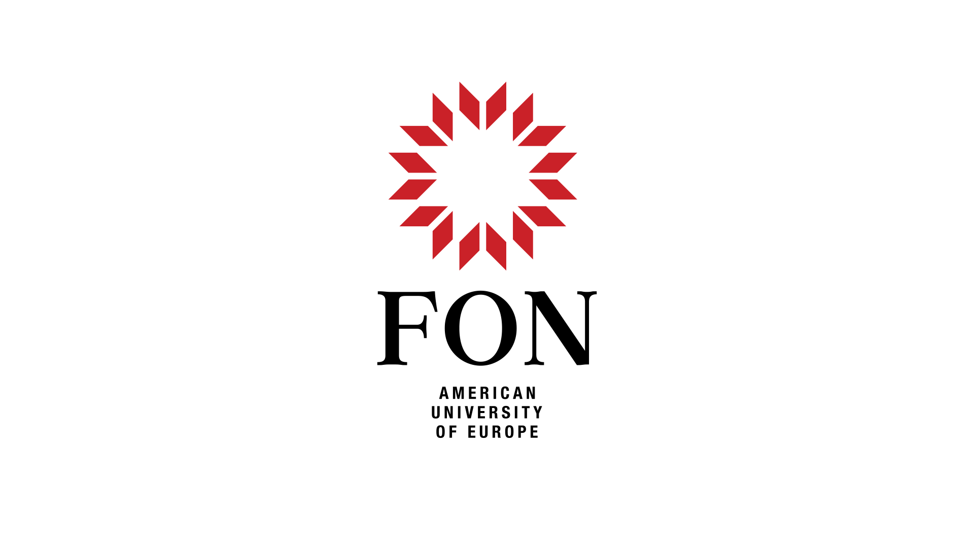
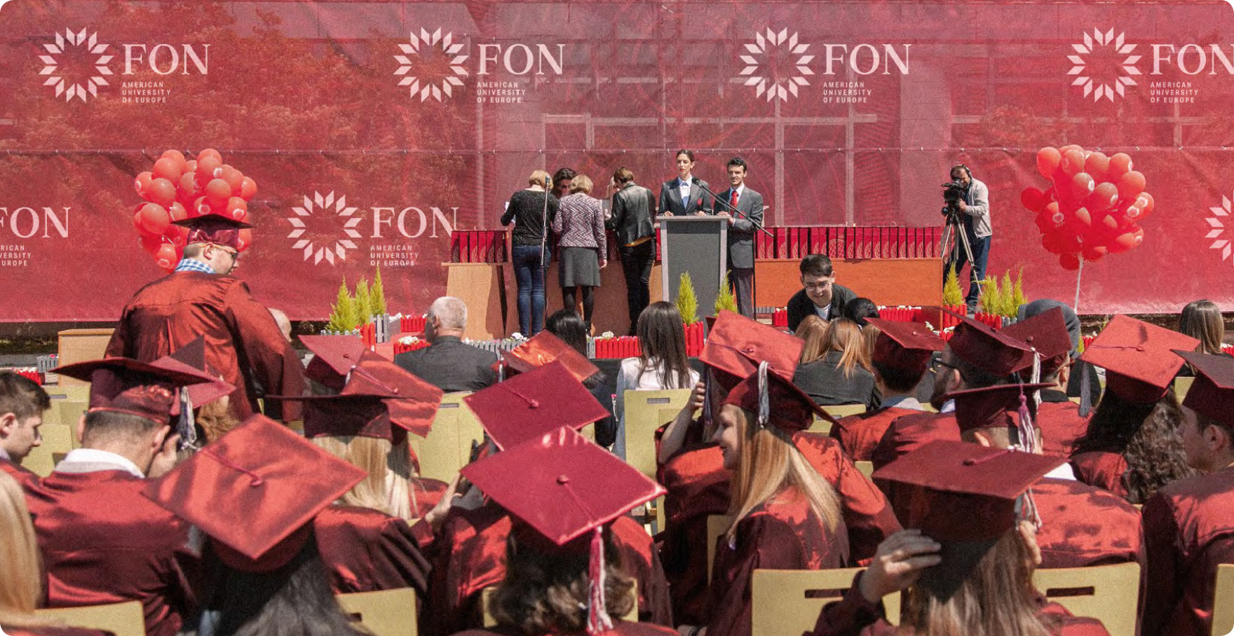
Working on this project I tried to convey the idea of academic success and accomplishment in an educational center through the use of visual symbolism.
This graphic design project was created as part of an open call for designers to redesign the logo for the American University of Europe – FON, following the university’s name change.
concept
Graduation cap
— part of the formal academic attire worn during the graduation
Open book
— associating knowledge, imagination
story
Employing the technique of reflection, a book symbol is derived from the rhombus.
The repetition of the book symbol within a circular format not only reinforces the visual communication of multiple books in an educational center, but also evokes the sensation of graduation caps soaring through the air. By incorporating this symbolism, the design captures the essence of the excitement and triumph associated with academic achievement, effectively communicating the message of success and accomplishment.
The repeated use of the symbol also adds a sense of unity and cohesion to the design, emphasizing the importance of education and knowledge exchange within the educational center.
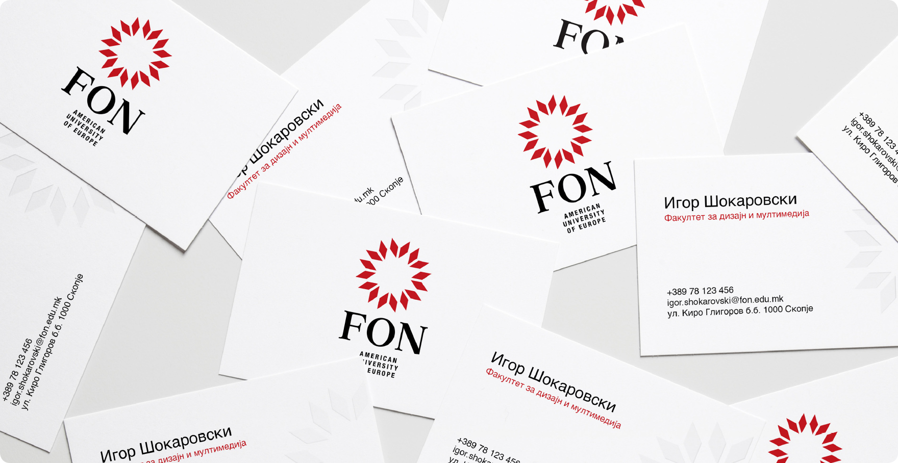
typography
I decided on this serif font because I want to emphasize the history of the university, being the oldest and largest private university in Macedonia. The selection of a serif font aligns with the conventions of graphic design employed in academic papers, research, and publications, thus lending an air of professionalism and credibility to the visual presentation.
color
Since its inception, the university has embraced red as its primary color, symbolizing the vibrant energy and passion of its students. Red is known for its stimulating properties, ability to motivate, and captivating attention. For secondary uses, I have selected gold color, representing prestige, success, and prosperity.